miniBB ® 

miniBB

®
Support Forums
  
 | Start | Register | Search | Statistics | File Bank | Manual |
The Other miniBB Support Forums / The Other /  
 

Do you like the new miniBB logo? Examples of the other miniBB draft logos inside.


Page  Page 1 of 2:  1  2  Next »

Author Paul
Lead Developer 
#1 | Posted: 19 Dec 2008 09:49 
We would appreciate anybody's opinion regarding our new logo. Example is at the top of forums.

Actually this thread started with the discussion of that logo:

miniBB New Logo Draft

How it fits the website etc.? Do you like it? Yes/no and describe your feelings please.

Thank you!

Author tom322
Active Member
#2 | Posted: 19 Dec 2008 13:11 
It feels like I wanna go to a tropical country ;). Orange by definition fits well with blue and green.. but then there are no other elements in orange on the website.. Maybe orange links, table borders, or other small elements in orange could be added.

Even though I personally would keep it "mini" and only leave the dots above the letters "i" in different color (or play with the dots somehow) and/or the "orange smile." I think I would not include "the sun" (or would make it in more subtle way somehow) because I more associate it with "travel" or "vacation" theme.

Btw. I like the buttons, they look very good, rounded on Firefox (hopefully other browsers will catch up).

Author Guest
~
#3 | Posted: 20 Dec 2008 21:51 
I agree, the orange seams out of place.

Author Vishal
Partaker
#4 | Posted: 21 Dec 2008 04:21 
I feel the earlier one had more professional appeal.

Author marsbar
Associated Member
#5 | Posted: 21 Dec 2008 15:45 
Hi Paul,
I prefer the original logo design, for I find it clear, simple and elegant. I feel the orange smiley in the new logo does not add anything to the design: the smiley serves only to obscure the text/central message.
If you feel strongly about introducing a new/different logo for the coming year, may I suggest applying just adding a stroke to the text (miniBB)? For example: blue text with a white stroke.
Cheers,
mb

Author Paul
Lead Developer 
#6 | Posted: 22 Dec 2008 04:46 
marsbar:
I prefer the original logo design, for I find it clear, simple and elegant.
Well, do you mean our earlier logo? Like this one:

Old Logo

Within few past months (or maybe even a year) we have gone through variety of new logo designs and still can't find a suitable one. So maybe next year we will start a logo contest... with quite huge prizes ;-)

Thanks for responses so far.

Author marsbar
Associated Member
#7 | Posted: 22 Dec 2008 05:23 
Paul:
Well, do you mean our earlier logo? [...] Within few past months (or maybe even a year) we have gone through variety of new logo designs and still can't find a suitable one.
Quite true. I was thinking of an even earlier version: the pre-smiley, pure graphical text version. (Er ... there was such a version, right? I don't trust my memory anymore!)
Cheers,
mb

Author Paul
Lead Developer 
#8 | Posted: 22 Dec 2008 08:25 
Not sure exactly what do you mean, but only the recent year version has "pure text version"... In the very early times we have had this:

Even older logo

Author marsbar
Associated Member
#9 | Posted: 23 Dec 2008 04:17 
Hi Paul,
Is the logo shown in your post (#8) the very first version ever adopted? I am not positive, but I thought there was an even earlier and simpler version (pure graphic text, minus the curved up lips).
All best -
mb

Author Paul
Lead Developer 
#10 | Posted: 23 Dec 2008 04:23 
That's right, it is really our first version of the logo, provided in my post #8 ;-)

There weren't any logo versions else presented in this thread ;-) We have text version only for the recent release, and actually only for that short period when we have switched to the "modern" layout.

Author Paul
Lead Developer 
#11 | Posted: 23 Dec 2008 04:50 
In the "smiley" logo I personally (and as a CEO ;-) would like to avoid the smiley element, in general. I know it looks very attractive and funny; however the smiley is a registered trademark sign, and we don't want to have problems with the law. So either we would need to present a smiley like it would not cross with the smiley definition from the trademark, either we would need to create something pure fresh.

Ok... from the working tapes of miniBB team :-) Below presented the list of all of our imaginary within the past year. Don't consider them as the final versions still.
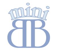
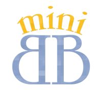
miniBB Logo Draft - Blue

miniBB Logo Draft - Gold

In the two examples above, we supposed to try to make a logo in the "corona" form. Later, we have denied the corona symbol, since nobody from us is the king.
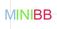
miniBB Logo Draft - Symmetry

miniBB Logo Draft - Colors

As you may notice, the wording "miniBB" is very symmetrical. It contains horizontal, vertical and the diagonal symmetries. The first example above just shows it, the second pretends to build a logo full of colors on this principle.


miniBB Logo Draft - Shadow

Above comes just yesterday's example. Very tough draft, but the idea here is the wording "BB" appears to be a mirrored shadow of "mini", like it would appear from the sun raising in the background. Overall it also gives an ultimate 3D effect to the board.

miniBB Logo draft - Zooropa

Above is just a funny example of how Zooropa logo from U2 fits to miniBB's older concept ;-)

Below follows the collection of assorted work by Sergei.

miniBB Logo Draft - Black

miniBB Logo draft - Grey

miniBB Logo Draft - mini

miniBB Logo Draft - SDM

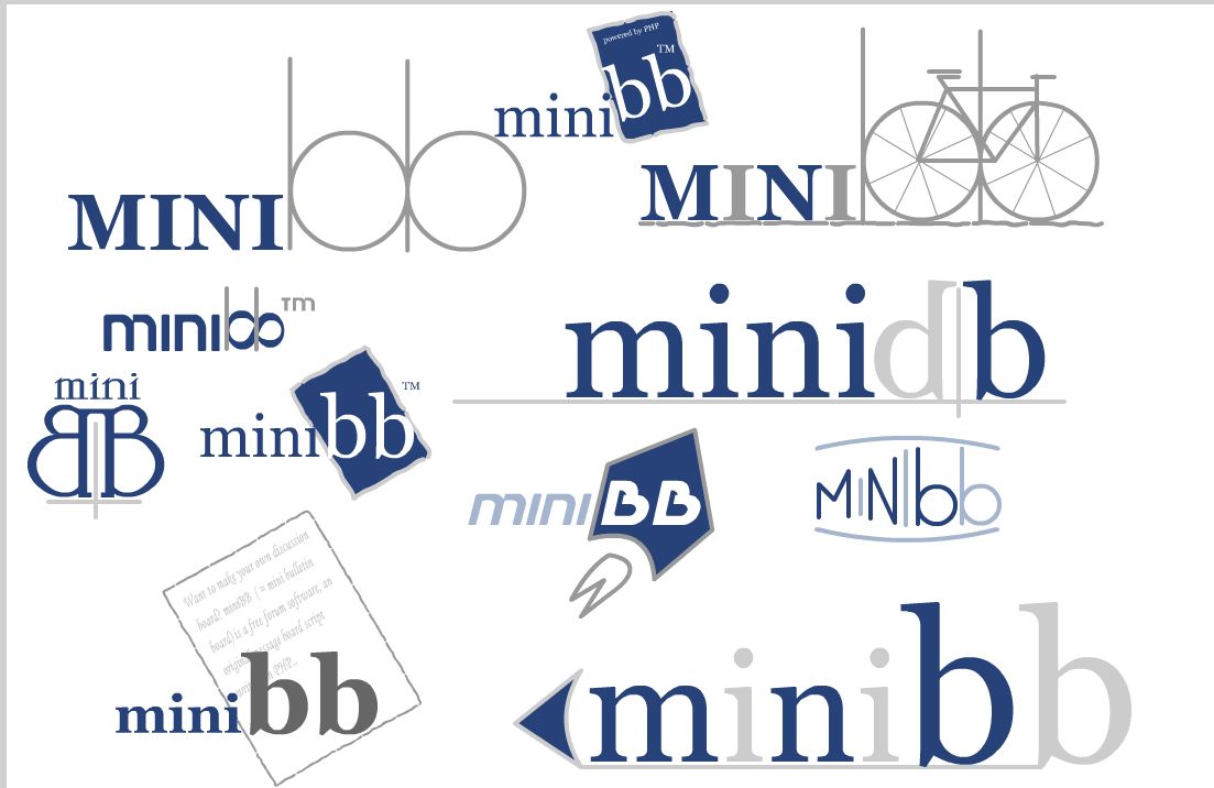
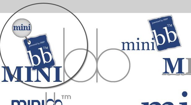
miniBB Logo various drafts

miniBB logo various drafts' fix

Click two pictures above to enlarge...

Author tom322
Active Member
#12 | Posted: 23 Dec 2008 22:05 
Hard to tell now, Sergei must be busy.. ;) I like the current one (but I'd make the dots above 'i') darker, maybe very dark blue, and after all would remove the smiley. I also like the one with the "powered by PHP" sign (but then I would remove this text about Php;).

Author marsbar
Associated Member
#13 | Posted: 24 Dec 2008 02:54 
Paul:
Below presented the list of all of our imaginary within the past year.
Wow, you and Sergei have been busy!
Of all the designs you have shown us so far, I like the logo that you have up on the site today (white lowercase sans-serif text, blue dots for the "i"s, plus thin blue curved up lips). To make today's logo even simpler and more professional-looking, I would ditch the curved up lips (i.e. make the logo be white lowercase sans-serif text with blue dots for the two "i"s).
With best wishes for Christmas and beyond -
mb

Author Sergeusz
Partaker
#14 | Posted: 24 Dec 2008 12:24 
To my mind orange smile is truly very bad logo for current colour palette ;)
I like logos with the sign of infinity and with rocket one.

Merry Christmas!

Author Sergeusz
Partaker
#15 | Posted: 29 Dec 2008 13:21 
Happy New Year!

Page  Page 1 of 2:  1  2  Next » 
The Other miniBB Support Forums / The Other /
 Do you like the new miniBB logo? Examples of the other miniBB draft logos inside.
 Share Topic's Link

Your Reply Click this icon to move up to the quoted message


  ?
Post as a Guest, leaving the Password field blank. You could also enter a Guest name, if it's not taken by a member yet. Sign-in and post at once, or just sign-in, bypassing the message's text.


Before posting, make sure your message is compliant with forum rules; otherwise it could be locked or removed with no explanation.


miniBB Support Forums Powered by Forum Software miniBB ® Home  Features  Requirements  Demo  Download  Showcase  Gallery of Arts
Compiler  Premium Extensions  Premium Support  License  Contact Us
Get the Captcha add-on: protect your miniBB-forums from the automated spam and flood.


  ⇑